28 January 2007
Parliament's Website - Blinkered Design
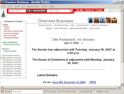
In the Parliament of Canada webpage Chamber Business there is a prominent example of bad design.

Look at that navigation information in the left-side column:
Sure, these official Chamber Business documents are organized by Parliament and Session numbers, and the site navigation has to be organized in the same way, but the navigation should match these Parliament and Session numbers with calendar dates. These dates should appear in the navigation column — or at the very least as cursor hover popups (although hover popups are less satisfactory because different browsers react to them in different ways).
Below is an example of the much more useful (from a citizen's viewpoint) navigation offered by the Ontario Hansard Index


Parliament of Canada, Chamber Business webpage. For a full-size view, click on the image, or look at the original Chamber Business webpage.
Look at that navigation information in the left-side column:
About Chamber BusinessThis is a textbook example of the blinkered approach to site design that we see far too often in the government's websites. Does any citizen, who is looking for government information — say a Hansard report of a speech by his/her MP — think of the date of that speech in terms of 36th or 37th or 38th Parliament, 1st or 2nd or 3rd Session? Of course not. We the people think of such things in terms of calendar dates.
39th Parliament, 1st Session
38th Parliament, 1st Session
37th Parliament, 3rd Session
37th Parliament, 2nd Session
37th Parliament, 1st Session
36th Parliament, 2nd Session
36th Parliament, 1st Session
35th Parliament, 2nd Session
35th Parliament, 1st Session
Sure, these official Chamber Business documents are organized by Parliament and Session numbers, and the site navigation has to be organized in the same way, but the navigation should match these Parliament and Session numbers with calendar dates. These dates should appear in the navigation column — or at the very least as cursor hover popups (although hover popups are less satisfactory because different browsers react to them in different ways).
Below is an example of the much more useful (from a citizen's viewpoint) navigation offered by the Ontario Hansard Index

Ontario Hansard Index, showing Parliament and Session numbers with calendar dates. For a full-size view, click on the image, or look at the original Ontario Hansard Index.