25 January 2007
Treasury Board Website, Weak Design
In the Treasury Board of Canada webpage "DPR 2005-2006, Parks Canada Agency" Section 2: Performance by Program Activities, when you scroll down, there is a small (450 × 372px) map "Figure 2: Natural Regions and National Parks of Canada, Click image to enlarge."
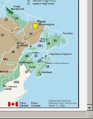
This "enlarged" 886 × 734px image is far too tiny – most of the text, including what seems to be a list of the names of the 39 parks, is illegible because it is too small. In this full-size screenshot of the lower right corner of this "enlarged" image, can you read "Prince Edward Island"?

Here's another tiny "enlarged" image — in the same Treasury Board of Canada webpage "DPR 2005-2006, Parks Canada Agency" Section 2: Performance by Program Activities, when you scroll down, there is a small (450 × 357px) map "Figure 11: The 154 National Historic Sites of Canada Administered by Parks Canada, Click image to enlarge."
This "enlarged" 850 × 676px image is far too tiny – most of the text is illegible because it is too small. In this full-size screenshot of the lower right corner of this "enlarged" Parks Canada map, how much of the text can you read?
One of the basic principles in the design of any website, especially one prepared with taxpayers' money, must be that any map displayed online has to be available in a version sufficiently large that all of the place names on the map are legible. That's obvious, isn't it?
In the same page, this statement appears:
"Level of Awareness and Access to Best Practice Information: In 2004-2005, the Agency commissioned a survey of other owners of national historic sites (see Background Performance Information www.pc.gc.ca library for a more complete description of the survey and how to obtain a copy of the results)."
Yeah, right. Here's a challenge: Go to this www.pc.gc.ca library — please note that I've made it much easier for you to find this "library" by providing a link, something the well-paid government website designers should have done but didn't — and see how long it takes you to find this "Background Performance Information." On second thought, forget how long, and just try to find it. Hint: a search, using these three keywords Background Performance Information, returns this helpful message: "No documents matching your query were found." The designers of this webpage clearly have not bothered to enquire if this works for someone not on the inside.
In that same page, the geniuses in charge of this website design tell the citizen, 23 times in 23 separate paragraphs, to go to www.pc.gc.ca for more information. Not once have they provided a link directly to the recommended information, to help the citizen. I've not been able to find any of this supposed additional information. Is anyone minding the store at the Treasury Board website design office?
This "enlarged" 886 × 734px image is far too tiny – most of the text, including what seems to be a list of the names of the 39 parks, is illegible because it is too small. In this full-size screenshot of the lower right corner of this "enlarged" image, can you read "Prince Edward Island"?

Full-size "enlarged" view
Here's another tiny "enlarged" image — in the same Treasury Board of Canada webpage "DPR 2005-2006, Parks Canada Agency" Section 2: Performance by Program Activities, when you scroll down, there is a small (450 × 357px) map "Figure 11: The 154 National Historic Sites of Canada Administered by Parks Canada, Click image to enlarge."
This "enlarged" 850 × 676px image is far too tiny – most of the text is illegible because it is too small. In this full-size screenshot of the lower right corner of this "enlarged" Parks Canada map, how much of the text can you read?

Full-size "enlarged" view
One of the basic principles in the design of any website, especially one prepared with taxpayers' money, must be that any map displayed online has to be available in a version sufficiently large that all of the place names on the map are legible. That's obvious, isn't it?
In the same page, this statement appears:
"Level of Awareness and Access to Best Practice Information: In 2004-2005, the Agency commissioned a survey of other owners of national historic sites (see Background Performance Information www.pc.gc.ca library for a more complete description of the survey and how to obtain a copy of the results)."
Yeah, right. Here's a challenge: Go to this www.pc.gc.ca library — please note that I've made it much easier for you to find this "library" by providing a link, something the well-paid government website designers should have done but didn't — and see how long it takes you to find this "Background Performance Information." On second thought, forget how long, and just try to find it. Hint: a search, using these three keywords Background Performance Information, returns this helpful message: "No documents matching your query were found." The designers of this webpage clearly have not bothered to enquire if this works for someone not on the inside.
In that same page, the geniuses in charge of this website design tell the citizen, 23 times in 23 separate paragraphs, to go to www.pc.gc.ca for more information. Not once have they provided a link directly to the recommended information, to help the citizen. I've not been able to find any of this supposed additional information. Is anyone minding the store at the Treasury Board website design office?
Comments:
<< Home
Revize is a Experienced web design companies and knowledgeable enough to design a website using the latest technologies. For more information visit- http://www.revize.comgovernment_websites.html
Post a Comment
<< Home
