28 January 2007
Parliament's Website - Blinkered Design

Parliament of Canada, Chamber Business webpage. For a full-size view, click on the image, or look at the original Chamber Business webpage.
Look at that navigation information in the left-side column:
About Chamber BusinessThis is a textbook example of the blinkered approach to site design that we see far too often in the government's websites. Does any citizen, who is looking for government information — say a Hansard report of a speech by his/her MP — think of the date of that speech in terms of 36th or 37th or 38th Parliament, 1st or 2nd or 3rd Session? Of course not. We the people think of such things in terms of calendar dates.
39th Parliament, 1st Session
38th Parliament, 1st Session
37th Parliament, 3rd Session
37th Parliament, 2nd Session
37th Parliament, 1st Session
36th Parliament, 2nd Session
36th Parliament, 1st Session
35th Parliament, 2nd Session
35th Parliament, 1st Session
Sure, these official Chamber Business documents are organized by Parliament and Session numbers, and the site navigation has to be organized in the same way, but the navigation should match these Parliament and Session numbers with calendar dates. These dates should appear in the navigation column — or at the very least as cursor hover popups (although hover popups are less satisfactory because different browsers react to them in different ways).
Below is an example of the much more useful (from a citizen's viewpoint) navigation offered by the Ontario Hansard Index

Ontario Hansard Index, showing Parliament and Session numbers with calendar dates. For a full-size view, click on the image, or look at the original Ontario Hansard Index.
26 January 2007
Parks Canada Website - A Citizen's View (9)
I know of two glaring historical errors that appear in the Parks Canada website. They've been there for years with no prospect of getting them straightened out.
Here's an excellent role model, that Parks Canada would do well to emulate — The Toronto Star newspaper gives prominence to The Bureau of Accuracy (see screenshot below), with a clear invitation to tell them about a mistake: "If you have information about an error that calls for a published correction, please" send an e-mail, or phone or fax, or mail a letter. An archive of recent corrections is available.

Toronto Star corrections webpage. For a full-size view, click on the image.
Here's another excellent role model, that Parks Canada would do well to emulate — CBC News Report a Typo or Inaccuracy

CBC News corrections webpage. For a full-size view, click on the image.
The only thing missing here is an archive of recent corrections, similar to that provided by the Toronto Star (above).25 January 2007
Treasury Board Website, Weak Design
This "enlarged" 886 × 734px image is far too tiny – most of the text, including what seems to be a list of the names of the 39 parks, is illegible because it is too small. In this full-size screenshot of the lower right corner of this "enlarged" image, can you read "Prince Edward Island"?

Full-size "enlarged" view
Here's another tiny "enlarged" image — in the same Treasury Board of Canada webpage "DPR 2005-2006, Parks Canada Agency" Section 2: Performance by Program Activities, when you scroll down, there is a small (450 × 357px) map "Figure 11: The 154 National Historic Sites of Canada Administered by Parks Canada, Click image to enlarge."
This "enlarged" 850 × 676px image is far too tiny – most of the text is illegible because it is too small. In this full-size screenshot of the lower right corner of this "enlarged" Parks Canada map, how much of the text can you read?

Full-size "enlarged" view
One of the basic principles in the design of any website, especially one prepared with taxpayers' money, must be that any map displayed online has to be available in a version sufficiently large that all of the place names on the map are legible. That's obvious, isn't it?
In the same page, this statement appears:
"Level of Awareness and Access to Best Practice Information: In 2004-2005, the Agency commissioned a survey of other owners of national historic sites (see Background Performance Information www.pc.gc.ca library for a more complete description of the survey and how to obtain a copy of the results)."
Yeah, right. Here's a challenge: Go to this www.pc.gc.ca library — please note that I've made it much easier for you to find this "library" by providing a link, something the well-paid government website designers should have done but didn't — and see how long it takes you to find this "Background Performance Information." On second thought, forget how long, and just try to find it. Hint: a search, using these three keywords Background Performance Information, returns this helpful message: "No documents matching your query were found." The designers of this webpage clearly have not bothered to enquire if this works for someone not on the inside.
In that same page, the geniuses in charge of this website design tell the citizen, 23 times in 23 separate paragraphs, to go to www.pc.gc.ca for more information. Not once have they provided a link directly to the recommended information, to help the citizen. I've not been able to find any of this supposed additional information. Is anyone minding the store at the Treasury Board website design office?
14 January 2007
Alberta's Online Encyclopedia
Northwest Territories Website - Unacceptable
"Site best viewed at 800 X 600 resolution."

This is an unacceptable approach to the design of a government website. Fewer than one in five computers now have screens as small as 800×600px (source).
Screen sizes in useWhat do they expect? Do they really think that each citizen who views this site should go out any buy a monitor (in the now nearly-unobtainable) small size 800 by 600 pixels?
Larger 1024x768 800x600
2006 Jul 19% 58% 17%
2006 Jan 17% 57% 20%
2005 Jul 14% 55% 25%
2005 Jan 12% 53% 30%
2004 Jul 10% 50% 35%
2004 Jan 10% 47% 37%
It is the responsibility of the website designer to see that any website operated by any government is designed to work properly with
(1) at least four or five of the most-used browsers, and
(2) several screen sizes, as are currently in use by citizens.
It is the responsibility of the department management to see that the site designer is meeting this requirement.
Parks Canada Website - A Citizen's View (8)
A much larger view of this magnificent sculpture should be available online. After all, this online information is available to many thousands of people who will never have the opportunity to visit The Forks National Historic Site in person.
There are numerous other small photographs in the associated pages of this website, that should be made available in a larger size.
13 January 2007
ParksCanada For Sale
Parks Canada Website - A Citizen's View (7)
Commemorative Plaque Models
Failed Validation, illegal characters

Failed validation report: HSMB page: Commemorative Plaque Models. For a full-size view, click on the image.
This faulty Parks Canada website is contrary to the Government's standards for website design.
11 January 2007
Parks Canada Website - A Citizen's View (6)
It returned a page showing thumbnails of photographs of monuments in Canada, with this note: "For a larger view...click on photo".
To see what the "larger view" looks like, I clicked on a thumbnail, "Rogers Pass Monument commemorating opening of Trans-Canada Highway, 1977".
The thumbnail is 150 pixels wide. The "larger view" option brings up a photo only 300 pixels wide. Just twice the size! This is so 1990s.
Like most people using the Internet these days, my screen is 1024 pixels wide. The "larger view" should be much larger than 300 pixels wide – that is if Parks Canada wants to show off its photo collection to advantage, making best use of the characteristics of the Internet as it exists today.
The "larger view" should be at least 700 pixels wide, and 900 would be better.
Parks Canada should take a close look at Wikipedia's excellent way of providing larger views of small thumbnail photos embedded in its articles. For example, see Wikipedia's Field Hill. This article includes a photograph (350×236 pixels) of the "View from the cab of a Canadian Pacific Railway locomotive at the 'Cathedral' signpost as it ascends the Big Hill." Immediately below this image, to the right of the caption, there is a standard graphic indicating that a larger image is available. Clicking on this graphic brings up a larger view (800×540px) of the same photograph. Immediately below this image, we see a link "Download high-resolution version...". Clicking on this link brings up an excellent full-screen view 1024×691px). All this is done using a single full-size image stored on the Wikipedia server, with the reduced sizes generated on demand, immediately before downloading.
Another example can be seen in Wikipedia's Cape Breton and Central Nova Scotia Railway. This article includes a photograph (300×127 pixels) "CB&CNSR freight train northbound on the Abercrombie spur." Immediately below this image, to the right of the caption, there is a standard graphic indicating that a larger image is available. Clicking on this graphic brings up a larger view (800×338px) of the same photograph. Immediately below this image, we see a link "Download high-resolution version...". Clicking on this link brings up an excellent full-screen view 1207×510px). Again, all this is done using a single full-size image stored on the Wikipedia server, with the reduced sizes generated on demand before downloading.
A third example can be seen in Wikipedia's List of national historic sites of Canada. This article includes a photograph (180×114 pixels) of the "Hartland Covered Bridge National Historic Site." Immediately below this image, to the right of the caption, there is a standard graphic indicating that a larger image is available. Clicking on this graphic brings up a larger view (800×508px) of the same photograph. Immediately below this image, we see a link "Download high-resolution version...". Clicking on this link brings up an excellent full-screen view 2048×1300px). Again, all this is done using a single full-size image stored on the Wikipedia server, with the reduced sizes generated on demand.
A fourth example (many hundreds are available) can be seen in Wikipedia's Athabasca Oil Sands. This article includes a photograph (300×127 pixels) of the "Minesite at Syncrude's Mildred Lake plant." Immediately below this image, to the right of the caption, there is a standard graphic indicating that a larger image is available. Clicking on this graphic brings up a larger view (800×600px) of the same photograph. Immediately below this image, we see a link "Download high-resolution version...". Clicking on this link brings up an excellent full-screen view 1024×768px). Again, all this is done using a single full-size image stored on the Wikipedia server, with the reduced sizes generated on demand.
(Later): A friend commented by e-mail: "That's all very well, but those large full-screen images have very large file sizes, and take too long to download" (he has a 56k dial-up connection).
My reply: Some of the full-screen images do have large file sizes, but if good photographic software is used to compress them properly, they can be kept within acceptable file sizes while maintaining high-quality on-screen images. For example, Parks Canada's larger view (above) of the Rogers Pass photo, a tiny 300×200px, occupies 74 kilobytes, compared to only 108 kilobytes for the full-size 1207×510px CB&CNSR photo (above). The full-size Mildred Lake photo (above) 1024×768px occupies only 135 kilobytes.
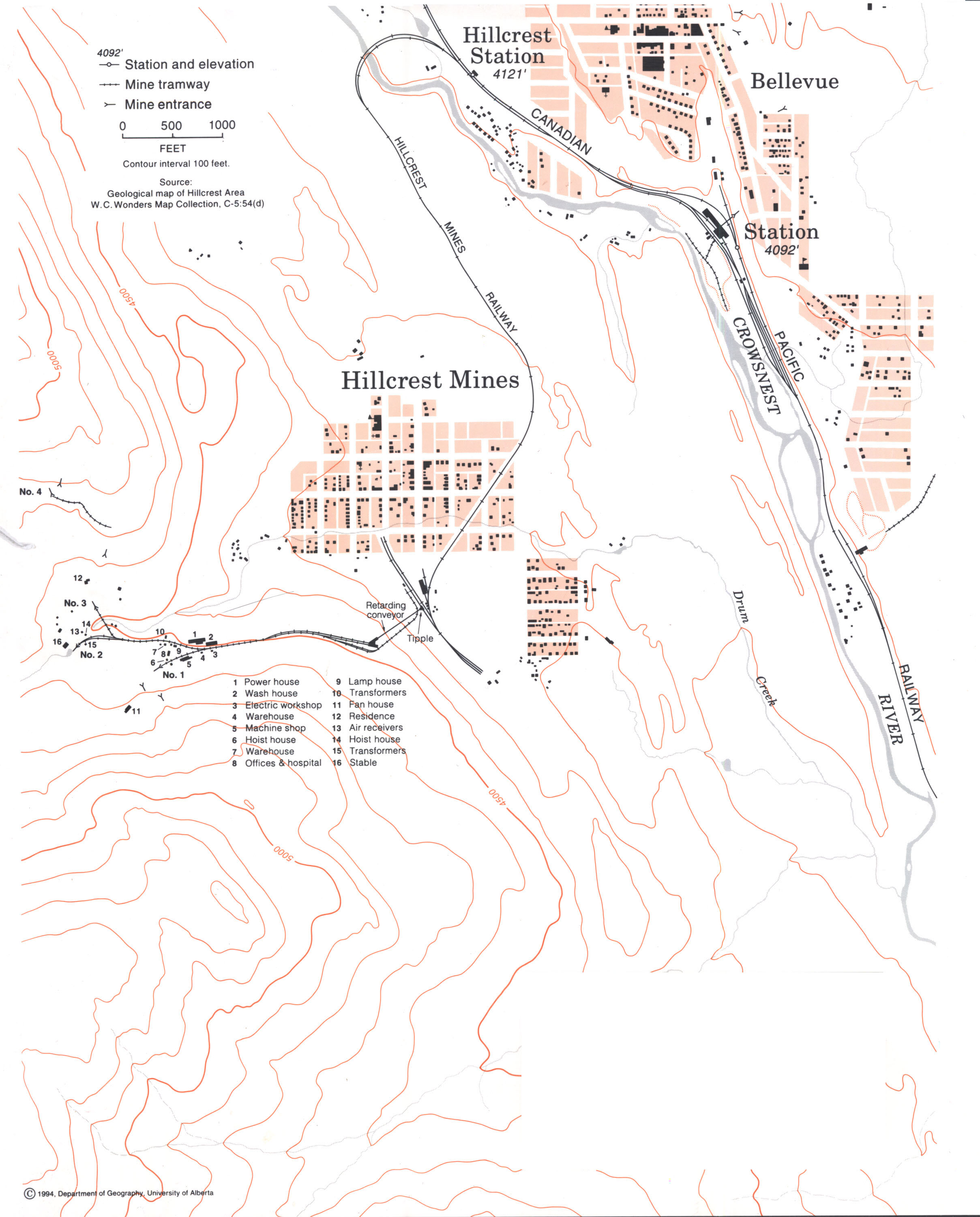
Addendum: January 17, 2007 16:35 UTC
Here's an example of a high-quality online rendition of an historic document, a superb archived copy 2417×3000px of an old map of Hillcrest Mines, Alberta.
Parks Canada Website - A Citizen's View (5)
It returned a page showing thumbnails of photographs. At the bottom this appeared: "Page 1 of 611". The only way provided, to look through the entire collection, was a "Next page" link. That is, if I want to see the thumbnails displayed on, say, page 567, I have to step through the whole collection, one page at a time, 1, 2, 3, 4, 5, 6, etc. until I get to page 567. This is, uh, an inadequate way to design a website.
It turned out that it is easy to get to page 567 or page 365 or page 99 or any other page in this collection, if you are willing and able to decipher and then edit the URL, but surely Parks Canada does not expect its viewers to do this. Surely they can provide a better way.
Parks Canada Website - A Citizen's View (4)
"In 1951, the Royal Commission on National Development in the Arts, Letters and Sciences noted the imbalance of the HSMBC's commemorative program and recommended that more attention be paid to preservation. In 1953, the Historic Sites and Monuments Act established the HSMBC by statute, enlarged it, and gave it increased resources. An amendment in 1955 specified the power to recommend national designation for buildings by reason of their age or architectural design. Thereafter, it studied more Canadian built heritage, expanding the concept to include streetscapes, districts, gardens, and urban and rural landscapes. With the introduction of the Heritage Railway Stations Act in 1989, the HSMBC was given the additional duty of evaluating Heritage Railway Stations. The Board continues to deal with the great number of requests for recognition of places, people and events in the various aspects of Canadian political, economic and social history..."
From a citizen's point of view, it would be a big help if this text included links (indicated by boldface type above) pointing toward additional information, such as, in the case of Acts, the Act text, etc.
10 January 2007
Parks Canada Website - A Citizen's View (3)
Two comments:
(1) This image is awfully dark. It should be modified with suitable photographic software to show a better (brighter) picture.
(2) There should be an option for the viewer to choose to see a larger image – large enough to use the available screen area to advantage. At this time, most Internet users have a screen 1024 by 768 pixels. A suitable image size for showing this Heritage Railway Station to advantage would be at least 700 pixels wide, and 900 would be better.
Parks Canada Website - A Citizen's View (2)
"The objective of the National Program for the Grave Sites of Canadian Prime Ministers is to ensure that the grave sites are conserved and recognized in a respectful and dignified manner. Another important objective of the program is to provide Canadians with information on the lives and accomplishments of each former prime minister, as well as the locations of their final resting places..."
"The following elements are part of the program: ...the establishment of a website with links to National Historic Sites of Canada that commemorate prime ministers, as well as to other prime ministers' web sites..."
In that text, the word "website" should be a link that takes the viewer to the website. Without this link, the "website" is impossible to find.
Parks Canada Website - A Citizen's View (1)
"Related Locations"
*Alexander Graham Bell National Historic Site of Canada
*Grassy Island Fort National Historic Site of Canada
*Cape Breton Highlands National Park of Canada
*Halifax Citadel National Historic Site of Canada
Clicking on any of these links produces an error message:
HTTP Error 404 - Not Found.
Parks Canada's website makes no provision for reporting a broken link.
04 January 2007
Parks Canada Ten Years Behind

Screenshot of Parks Canada website. "System Requirements... Browser: Netscape 7.2 or newer release." For a full-size view, click on the image.
Source: http://www.pc.gc.ca/apps/dci/source/install_ns.asp?langId=0&ref=http://www.pc.gc.ca/apps/dci/source/3d_e.asp?sitename=mar&theme=te&btn_state=%20Texte%20seulementNote that Parks Canada's screenshot examples are so small that they are illegible.
![]()